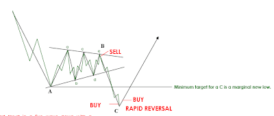
For anyone who thinks this rally isn't almost over, just compare the charts with the diagram-upside down of course.
Dec 21, 2009
Dec 20, 2009
Actual Chart of Great Depression
Here is an accurately proportioned chart of the Great Depression with some crude wave labeling. I have placed on the chart where I think we may be currently. There are 2 options depending on the size and degree of the current depression. Well actually, there are 3, this could be the end of B.
2012 - A New Beginning
The mayan calendar ends in 2012. Many take this to be the end of the world. But actual translation is for a "A New Beginning". This chart shows what I think other Elliot Wave Theorists are missing. The waves A, B, and C are normally of similar length timewise, provided the trajectory is of a similar angle. On this chart, I have made the 3 boxes equal, but more than likely B will be drawn out longer and C will be shorter, due to their nature as well as the effects of the excessive government stimulus and liquidity being pumped into the system causing B to drag out longer than it normally would. The C wave is usually a more powerful wave and should take a sharper trajectory downward, but it doesn't have to, so I put the average scenario on the chart. This also plays into my 10-15% market correction with a run to 1230 on the S&P before it plummets to the area between 120 and 400. UPDATE 12/21: based on current action there should be at least a 15% correction if not more. This correction COULD be the end of the B wave as well.


Dec 12, 2009
Great Depression Chart 10/1928-12/1954
Just to kick off this blog, I think a post showing our future is in order. This can be used in case of fire as a reference. It looks like we are mirroring 1929 right now.
Subscribe to:
Comments (Atom)


